Logo Types Explained
The Power of a Great Logo
Your logo is more than a mere symbol; it is one of the faces of your brand and a vital tool in your marketing arsenal. A well-designed logo can set you apart from the competition.
Whether you are launching a new venture or considering a redesign, understanding the different types of logos is crucial.
Here’s a guide to help you navigate the world of logo design.
Types of logos
Monogram
When a company name is too long to work as a logo on its own, the initials can carry it. Done well, a monogram is bold, compact, and works in places where a full name wouldn't - the corner of a garment label, a small embossed stamp on packaging, a social media avatar. Brands like HBO and IBM use it. They condense longer names into a memorable, stylish emblem.
When to choose a monogram
Your company name is three or more words and too long to work as a wordmark.
Your initials are distinctive and not shared with well-known competitors.
You're in a field where tradition and authority matter - finance, law, luxury, education.
When to avoid it
Your initials could be confused with a competitor's.
Mascot
Mascot logos feature an illustrated character, often creating a friendly, approachable brand image. They are particularly effective if your target audience includes families or children. Great examples are KFC’s Colonel and McDonald's Ronald McDonald. They make the brand more relatable and personable.
When to choose a mascot
Your audience includes families, young people, or communities built around shared interests.
You want to differentiate a lot from your competitors, and having a mascot is not typical for your industry
You're building a brand where warmth and personality are the main differentiators.
Your brand story revolves around a specific person or persona.
When to avoid it
You don't have the resources to maintain a character consistently across everything. A mascot needs rules around how it looks, moves, and behaves. It's a character, not just a logo.
Emblem
Emblem logos are often more detailed, combining text within a symbol or icon, like a badge or crest. They suit businesses that want to project a traditional, classic image. Great examples are Starbucks and Harley-Davidson. Emblems give your brand a sense of heritage and authority.
When to choose an emblem
You're in a field where heritage and prestige carry weight - craft, automotive, food and drink, sport, and education.
Your products will carry the logo as a physical badge or stamp.
You want a mark with a strong overall shape - something that reads like a seal.
When to avoid it
You need the logo to work very small - emblems lose detail fast and can become unreadable as app icons or website favicons.
Modular Logo
A modular logo is a type of logo design that is characterised by its versatility and adaptability. It consists of several distinct elements or modules that can be rearranged, modified, or used independently while still maintaining the overall brand identity. This approach allows the logo to be flexible and functional across various applications and contexts.
The key feature of a modular logo is its ability to change form without losing its core identity. For example, a modular logo might have a central symbol that remains constant, accompanied by interchangeable elements that can be tailored to different mediums, campaigns, or sub-brands.
Check out the logo for the 2028 Olympic Games in LA - it is a great example of a modular logo. This kind of identity works for organisations that need to feel consistent and varied at the same time - big enough to have sub-brands, campaigns, or departments that need room to breathe without breaking away from the main identity.
When to choose a modular logo
You're a large organisation with multiple divisions, product lines, or sub-brands.
You run different campaigns across very different audiences, but need them all to feel connected.
You're a cultural institution - a university, museum, opera, festival or country - where variety is part of the identity.
When to avoid it
You're a small business. Modular identity systems require documentation, governance, and design resources that don't make sense at a small scale.
You need one simple logo that anyone on your team can use without a guide.
Wordmark
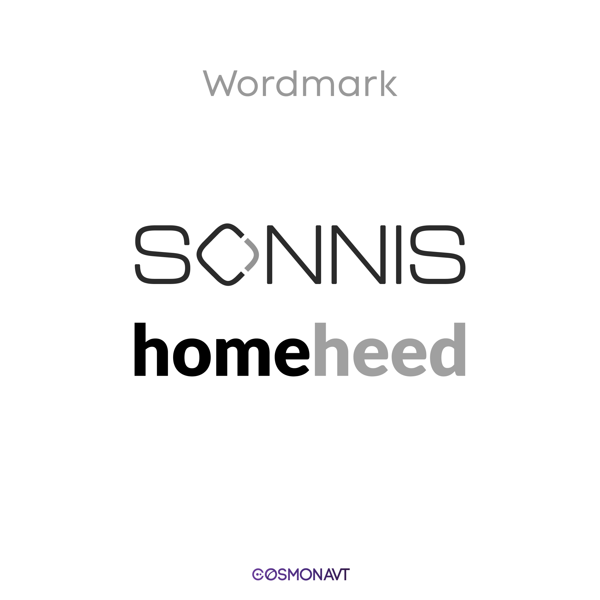
Wordmarks are logos that focus on your company name alone. Think of the distinct typography of Google or Coca-Cola. This type of logo is ideal if you have a unique business name and want to make it instantly recognisable. The choice of font and colour plays a crucial role in conveying your brand's personality.
When to choose a wordmark
Your business name is short, distinct, and easy to read at a glance.
You want the brand built around the name - not around a symbol
You're in law, consulting, finance, or any field where professionalism and clarity are what build trust.
When to avoid it
Your name is long or complicated
Your name is too generic for styling alone to set you apart.

Abstract Logo Mark
Abstract logo marks are geometric shapes that create a unique brand identity. They don't represent the industry you are working in like the Nike Swoosh. They’re perfect for conveying what your company values without showing it directly. Think of all the logos of coffee shops with coffee beans. This type of logo can set you apart with an original design.
When to choose an abstract mark
You need a symbol that works across languages and cultures without translation.
You want a mark that won't tie the brand to a specific product - one that can grow as the company grows.
You have the marketing budget to build what the shape means in people's minds, because it won't be obvious on its own.
When to avoid it
You're a small or local business without the budget to make the shape mean something.
You need people to immediately understand what you do from your logo alone.

Combination Mark
Combination marks blend a wordmark with an icon or mascot. This versatile approach lets you use the elements together or separately. They offer great flexibility in branding. Brands like Doritos and Lacoste use this style to maximise brand recognition.
When to choose a combination mark
You're launching a new brand and need to be readable immediately.
You need the logo to work across a wide range of contexts - website, social media, printed materials, signage.
You want flexibility now and the option to simplify later.
You're not sure which type of logo is right. This is the safest starting point.
When to avoid it
You want a very minimal look. If the icon doesn't add anything, the name can't carry on its own; it's getting in the way.
Brand Mark (pictorial mark)
Brand Marks are logos that use an image or symbol, such as the Apple logo or the Twitter bird. These work well to associate your brand with a specific visual icon. But they need a lot of marketing to establish brand recognition. The first version of Apple's logo had the company's name stand right next to the symbol. It took years of marketing and advertising for the symbol to become recognisable.
When to choose a brand mark
You're an established business simplifying an identity that already has strong recognition.
Your symbol has been used alongside your name for years and is already associated with your brand.
You have the budget and patience to build recognition from scratch.
When to avoid it
You need people to know your name at first contact.

How to choose the right logo type for your business
The right choice depends on where you are as a business, who you're talking to, and what the logo needs to do in the real world. Here's a practical starting point.
New business, any sector: Start with a combination mark. When no one knows you yet, the name has to do the work. A combination mark gives you readability from day one and a symbol that can grow into something standalone over time.
Professional services: law, consulting, finance: A wordmark or monogram. These fields run on trust and authority. The name, presented clearly and confidently, is enough. Anything more can undermine what you're trying to communicate.
Consumer goods, food, retail: Combination marks and emblems both work well. Physical products benefit from logos that look good on packaging and labels. If the brand has genuine warmth at its core, a mascot might be worth considering.
Tech and digital products: Abstract marks, wordmarks or combination marks. Your logo needs to work at the size of a phone app icon and at the size of a conference banner. Test both extremes before you commit.
Large organisations and institutions: Ask whether a modular system makes more sense than a fixed mark before defaulting to one logo. Universities, cultural organisations, and governments increasingly choose systems - because a system can do things a single mark can't.
What every good logo needs, regardless of type
It reflects what you actually do. Not what looks good in isolation - what's true about your business. A logo that misrepresents the company confuses people before you've even had a conversation.
It works at any size. From a small website icon to a large outdoor sign. If it stops working at either extreme, it needs some more work.
It will still look right in ten years. Logos that follow the current trend date badly. Aim for something that feels current without being tied to a trend that will die out in a few years.
It works without colour. Embossed stationery, black-and-white print - your logo will end up in single-colour situations. It has to look good without colour.
It's legally yours. Check that your mark isn't too similar to an existing trademark in your market. If you can, register it. Do this early - changing a logo after launch is far more expensive than checking before. Legal essentials to know before you get your first logo - read more.